Prosemino
OverviewProsemino is a UK-based climate tech venture builder supporting early-stage companies developing net-zero technologies. The website needed to clearly communicate Prosemino’s mission, venture model, lab capabilities, and portfolio to a diverse audience including founders, partners, and investors.
My Role
Information Architecture
Hi-fi Design
Design Systems
Interaction Design
User Flow Design
Responsive Design
Motion and Interaction Design
Prototyping
Brief
Prosemino required a website that clearly communicates its venture-building model within the climate-tech sector to a diverse audience of founders, partners, and investors. The brief focused on translating complex scientific and commercial processes into a structured, accessible digital experience while maintaining credibility and professionalism. The site also needed to be scalable and CMS-driven to support future growth and evolving content.
My Role
UX/UI design, shaping the information architecture, visual system, and responsive experience while collaborating closely with the developer and client through review and iteration.
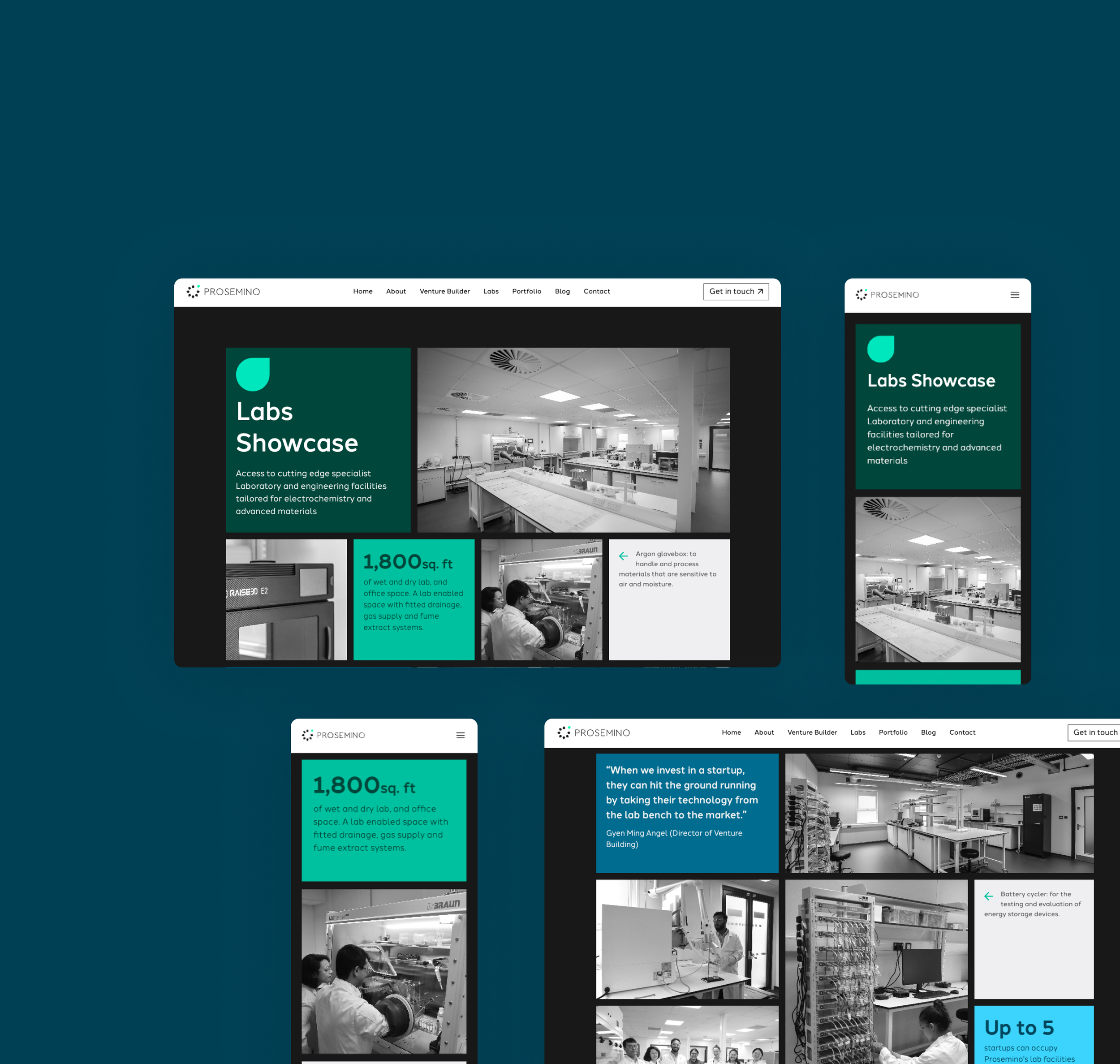
The work involved UX and UI design, defining the information architecture and page structure, and developing a scalable design system. The site was designed responsively across desktop, tablet, and mobile, with cross-browser QA in Chrome, Safari, and Firefox to ensure consistency.
CMS content structuring and population were carried out prior to launch, alongside ongoing client reviews and close collaboration with the developer throughout the build.
Goal
Design a clear, credible, and scalable website that communicates Prosemino’s venture-building model with confidence, supports multiple audience types, and provides a flexible CMS-driven structure for long-term growth.
UX Approach
Content Structure
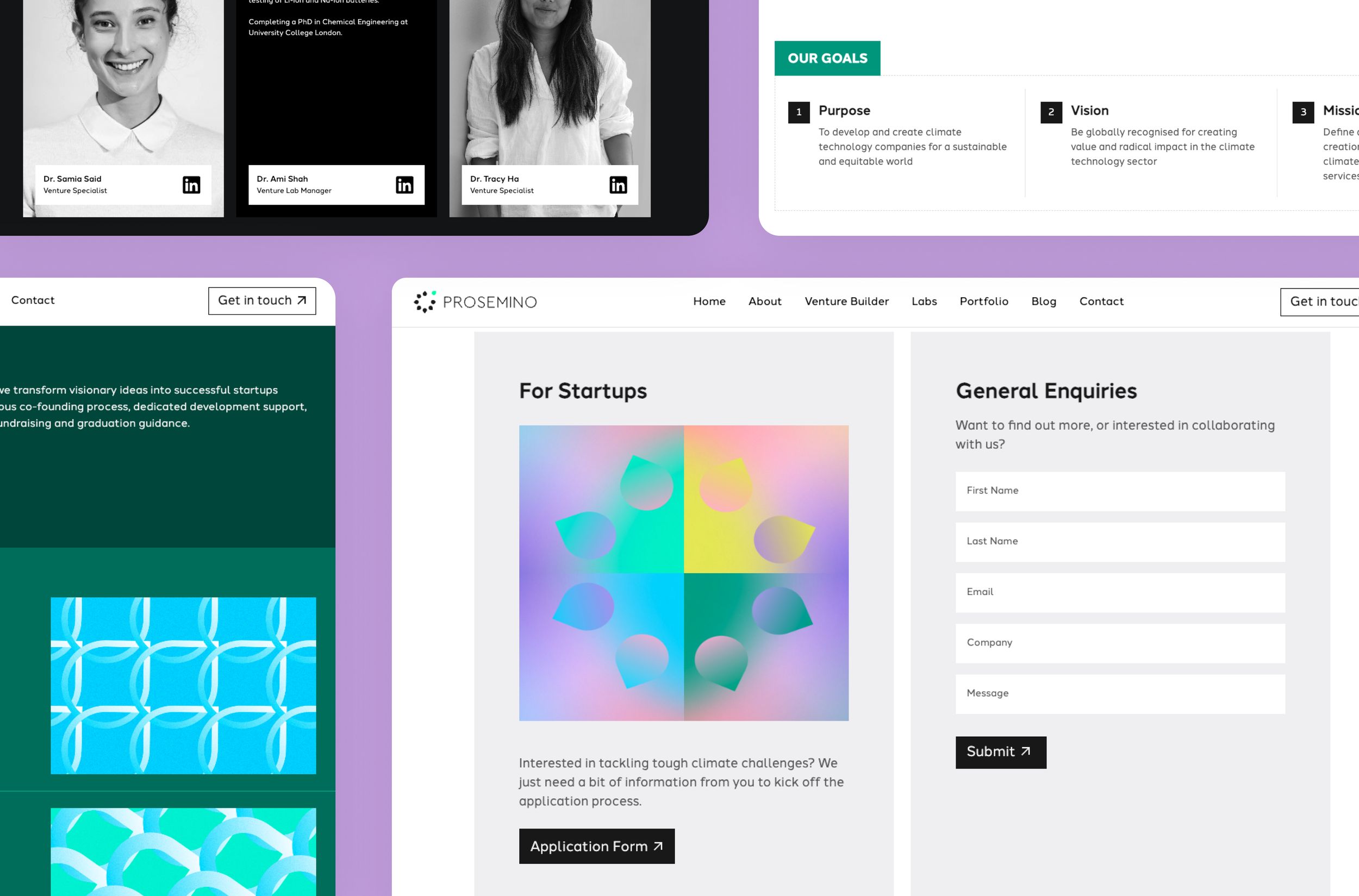
The site was structured to guide users through Prosemino’s offering in a clear and logical way. Core areas — Venture Builder, Labs, Portfolio, and About — were intentionally separated to support orientation and clarity.
Progressive Disclosure
Information was layered to avoid overwhelming first-time visitors. Content is introduced in digestible sections, allowing users to explore deeper details as needed.
Information Hierarchy
A strong page hierarchy was established to improve scanning and readability. Headings, spacing, and layout were designed to help users quickly identify key information and navigate complex content with confidence.
Clarity in Complexity
The overall goal was to make complex venture-building processes understandable within a few scrolls. Structure and pacing were used to balance depth with accessibility.
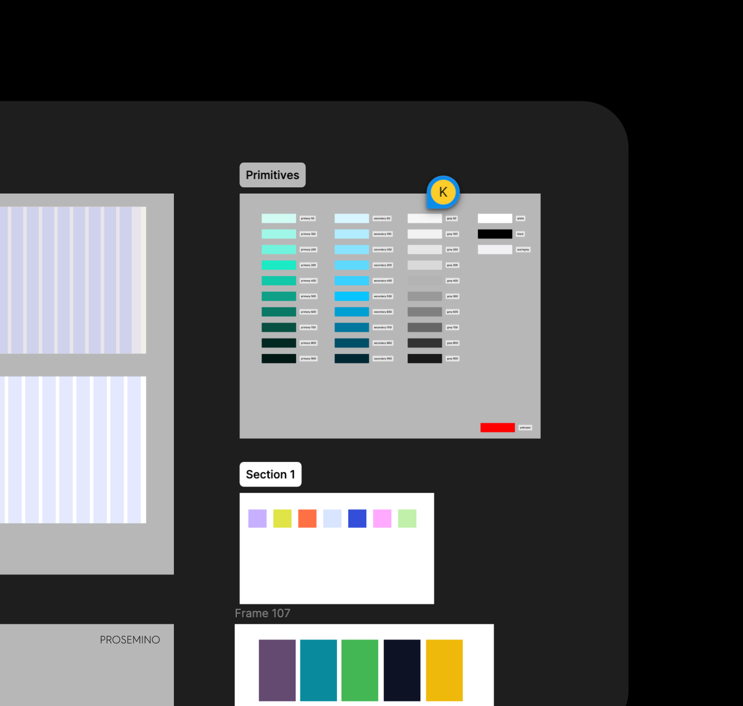
Design System
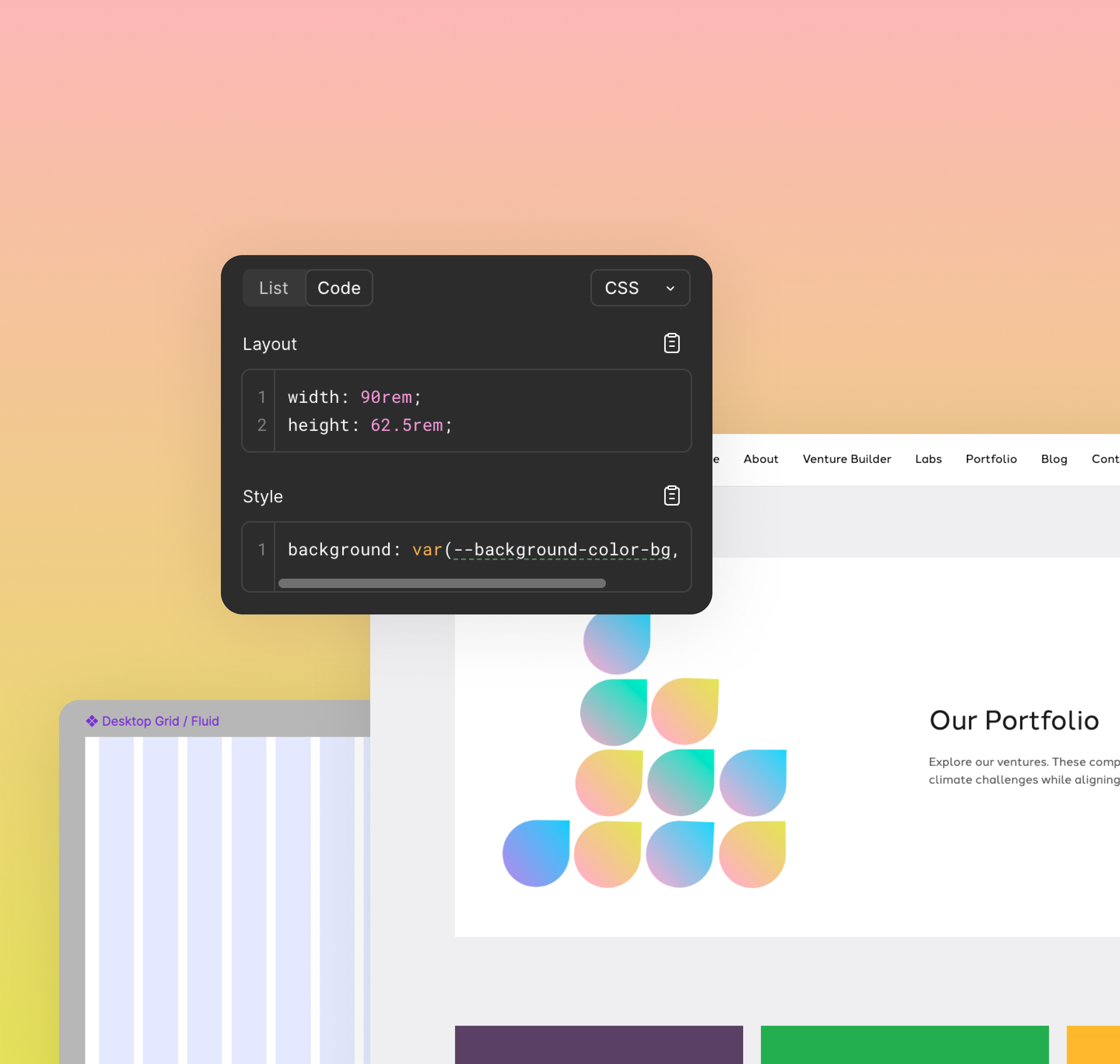
A design system was developed to ensure consistency and scalability across the website. It defined a clear typography hierarchy, structured colour usage and spacing rules, and a set of reusable components including navigation, cards, sections, and buttons. Responsive behaviour guidelines were also established to maintain coherence across devices.
This system streamlined collaboration with development and created a flexible foundation to support future growth and content expansion.
Collaboration with Development
Close collaboration with the developer throughout the build process included regular design handovers and clarifications, iterative layout adjustments in response to technical constraints, and careful review of implementation to ensure design intent was accurately translated into the final product. This ongoing alignment reduced friction and contributed to a cohesive, high-quality outcome.
CMS & Content Population
Preparation for launch included structuring and populating the CMS, ensuring content layouts remained flexible and readable, validating that varying content lengths did not disrupt the design, and designing components to adapt gracefully to future updates. This approach established a maintainable and scalable foundation for the site post-launch.
Responsiveness and QA
The website was designed and tested across desktop, tablet, and mobile to ensure a consistent and responsive experience. Cross-browser validation in Chrome, Safari, and Firefox confirmed reliable behaviour across environments. This included thorough checks of layout, spacing, typography, and interaction patterns to maintain consistency and usability across devices and browsers.
Impact and Outcome
The redesigned site launched successfully and is now Prosemino's primary web presence, used to attract founders, partners, and investors across the clean tech space. The CMS-driven structure gives the team full editorial independence, allowing them to publish new portfolio companies, blog posts, and programme updates without design or development involvement. The visual identity established through the project gave Prosemino a brand presence that reflects the credibility and ambition of the organisation for the first time.