Tranquiliti
OverviewTranquiliti was a cross-platform student wellbeing platform designed for secondary schools. It enabled students to complete regular wellbeing check-ins through a mobile or web app, while providing teachers and senior leaders with a structured dashboard to monitor trends and identify emerging concerns. The value of the product lay in shifting schools from reactive pastoral care to proactive, data-informed support.
Built around a structured wellbeing framework, the platform translated student input into clear, actionable insight at class, year group, and whole-school levels. Adopted by multiple schools and later acquired by Tes, Tranquiliti demonstrated that complex wellbeing data could be made accessible, ethical, and usable at scale.
My Role
Information Architecture
Hi-fi Design
Design Systems
Interaction Design
Illustration & Character Design
User Flow Design
Motion Design (Rive)
Prototyping
Tranquiliti was created to help schools move from reactive to proactive wellbeing support. The goal was to design a system that enabled regular student check-ins and translated that input into clear, actionable insight for teachers and senior leaders.
The scope included a student-facing mobile and web experience, alongside a browser-based dashboard for staff. The platform needed to function within real school constraints, including safeguarding requirements, device policies, and limited staff time, while handling a complex wellbeing data model in a way that remained clear and usable. The outcome aimed to balance privacy, clarity, and scalability across multiple user roles.
Brief
My Role
Discovery & Research
I joined Tranquiliti at an early stage and led UX and UI design across both the student and staff experiences. The process began with research and definition, including workshops with students and teachers, school visits, and mapping safeguarding and device policy constraints. These early insights shaped decisions around tone, trust, privacy, and role separation.
Information Architecture & User Flows
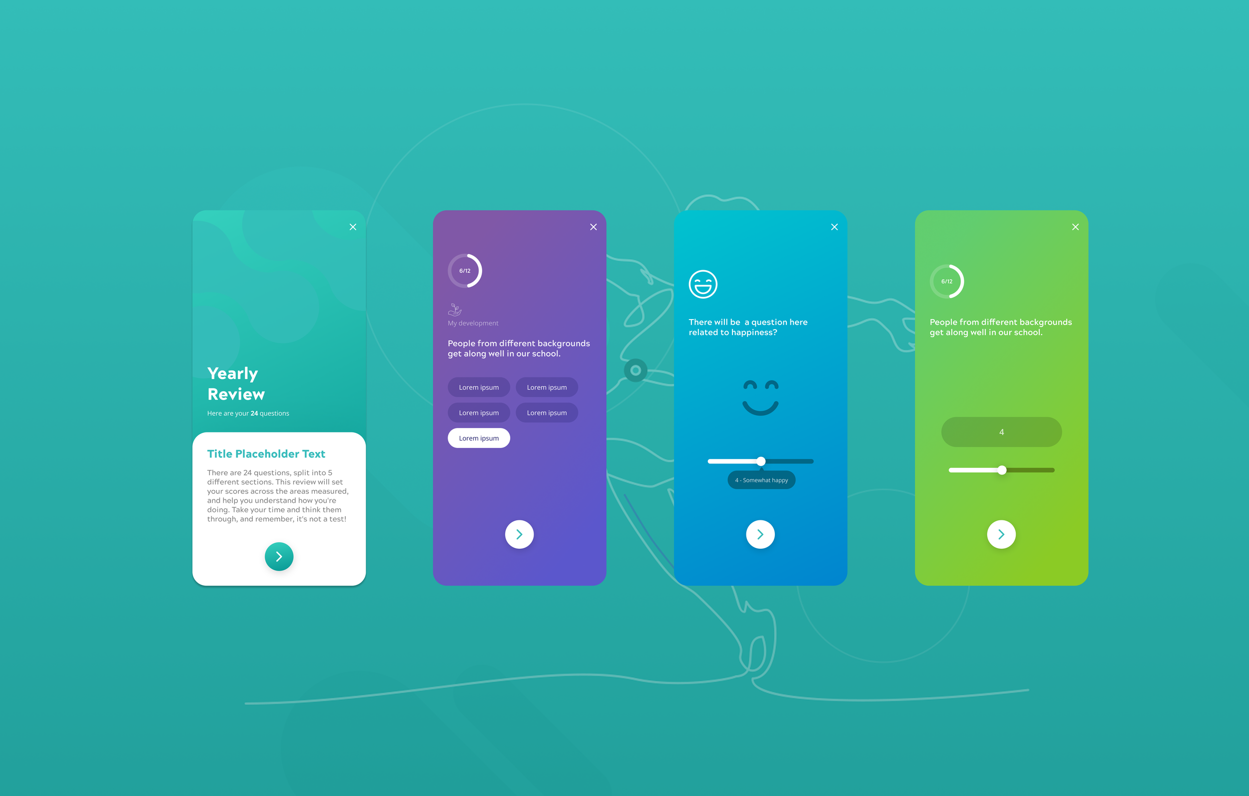
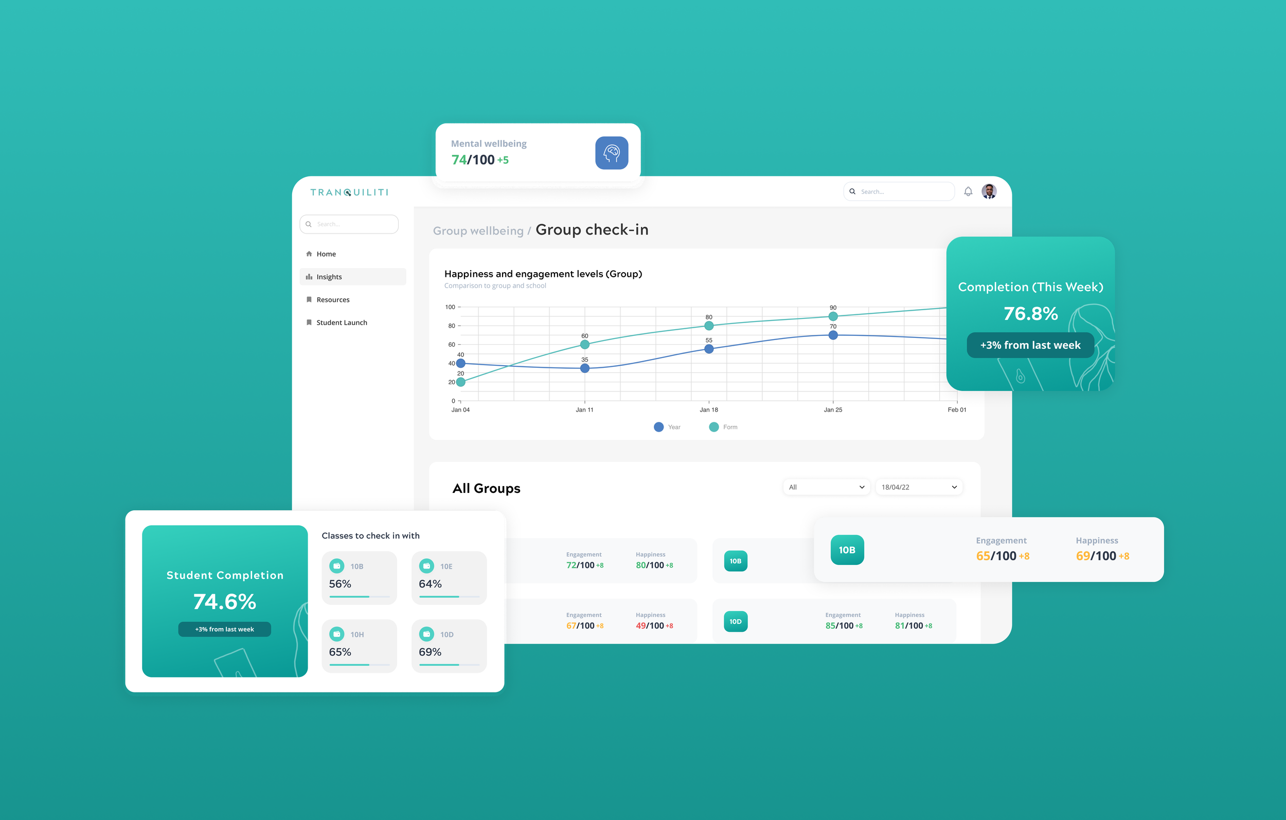
Following research, I defined user journeys and structured the information architecture for both sides of the platform, collaborating closely with the founders. This involved translating a complex wellbeing framework spanning more than forty dimensions into a coherent system that could support weekly student check-ins and multi-level staff insight.
Clear role-based access patterns were established early, ensuring students, form tutors, heads of year, and senior leaders each had focused interfaces built on the same underlying data model.
Wireframing & Interaction Prototyping
Low-fidelity wireframes were developed to validate hierarchy, navigation, and data presentation before visual styling was introduced. Interactive prototypes in Figma were used to test progression, dashboard clarity, and student flow pacing in an iterative workflow.
This phase focused on reducing cognitive load and ensuring that both the student check-in flow and the staff dashboards were intuitive under time constraints.
Design System & High-Fidelity UI
Validation, Iteration & Delivery
As the product moved from wireframes into visual design, I created a scalable design system to support consistency across web and mobile. Foundational styles such as typography, colour, spacing, and layout rules were defined alongside reusable components and states, maintaining best practices while staying aligned with contemporary design trends.
This system provided the framework for high-fidelity UI design, ensuring dashboards, student flows, and data visualisations remained coherent as features expanded. Responsive behaviour was considered from the outset, particularly given differing school device policies. Developer hand-off was considered throughout the creation of the design system to ensure a smooth handover.
Usability feedback informed refinements throughout development. I worked closely with developers to ensure design intent translated accurately into production, particularly around dashboard hierarchy, data visualisation clarity, and safeguarding-related visibility rules.
As the team expanded, the design system and documentation supported alignment across disciplines and enabled the platform to scale without losing coherence and ensured that new in-house designers could navigate the system efficiently.
Main Product Design Challenges
-
The product’s value depended on students answering honestly. Any perception that their responses could lead to consequences would undermine both trust and data quality. The UX needed to communicate clearly what was anonymous, who could see individual responses versus aggregated insight, and why participation mattered. Getting that framing right, through onboarding, microcopy, and the check-in interface itself, was one of the most critical design challenges on the project.
-
Students, form tutors, and senior leaders had completely different mental models, time constraints, and goals. A Year 9 student completing a five-minute check-in on their phone needed a fundamentally different experience from a deputy headteacher reviewing cohort trends before a Monday morning briefing. Designing these as distinct but coherent experiences, while sharing the same data model and visual language and remaining genuinely fit for purpose in each context, required constant prioritisation.
-
The underlying data model, grounded in The Children's Society's Good Childhood Index, tracked student wellbeing across over 40 areas spanning personal wellbeing, social and emotional skills, and school climate. Presenting this in a way that did not overwhelm teachers, and that pointed clearly to "what next?" rather than just showing numbers, was a significant information architecture challenge. The solution centred on progressive disclosure, presenting the most important signals prominently, with the ability to drill down rather than presenting all complexity at once.
-
A significant number of UK secondary schools ban student phones entirely. If Tranquiliti only worked as a mobile app, it would be unsellable to a large chunk of the market. Ensuring the student-facing experience was fully functional and genuinely good on a desktop browser and tablets shaped core decisions about the layout.
-
The platform also introduced a Class Discussion Mode in response to feedback from schools. Launched from the staff dashboard, it generated a structured presentation based on weekly student responses and topic votes, enabling guided classroom discussions. Unlike the private dashboard interface, this feature had to function clearly on a projector, remain legible from a distance, and require minimal interaction during lessons. Typography, contrast, and data visualisation were adapted accordingly to support clarity in a shared classroom setting.
Impact and Outcome
Tranquiliti launched commercially and was adopted by multiple schools and academy trusts, including Anglian Learning and Rainham Mark Education Trust, reaching tens of thousands of students across England. At Harrogate Grammar School, the platform scaled rapidly during COVID-19 closures in 2020, reaching nearly 1,000 active users, almost half the student body, within weeks of rollout. Deputy Headteacher Tim Milburn said, “Tranquiliti understands the needs of schools, teachers and students and have tailored the service accordingly.”
Duncan Cooper, Deputy CEO of Anglian Learning, described the approach as something that “will soon be an essential part of how the sector thinks about education.” Heidi Smith, Head of Counselling at Warwick Academy, said she was “so excited and impressed with Tranquiliti as a product and as an organisation.” In late 2022, Tes made a strategic investment in the company, further validating its relevance within the education sector.